Trend Following Diversification with a $RUT Iron Condor
Overview:
Happy New Year! If you follow me on Twitter, you know that yesterday I sold a March 14 Iron Condor with 80ish days to expiration. I like to have some non-directional options trades on because they complement a Trend Following approach to options trading. I will note that I am not the most bad ass Iron Condor trader ever, but I have had success over time. I was traveling yesterday morning and had a sitting order in the market that was filled. While I’m not thrilled about the the fill price or the short call delta, the entry is still reasonably close to what I wanted.
Non-Directional Trading:
When I trade Iron Condors or short strangles, I track my positions on a daily basis in excel. I track the greeks and also look at the trades using a probability cone that is based on current ATM implied volatility. Using a probability cone to track positions is something that Dan Sheridan discusses and I began using excel to track the values after seeing a great implementation of it on this blog. I think probability cones do a good job of explaining why trades are getting into trouble and that enables you to improve your trading.
If you look at the probability cone below, you can see the current $RUT price as an orange dot. The blue lines plot a 1 standard deviation move projected out in time and the green lines plot a 2 standard deviation move. I use implied volatility to calculate the standard deviation and I’m taking the average implied volatility at the money. In order to calculate average implied volatility, I use the 4 ATM strikes. For example, RUT closed at 1163ish and I averaged the implied volatility of the individual calls and puts at the 1160 and 1170 strikes.
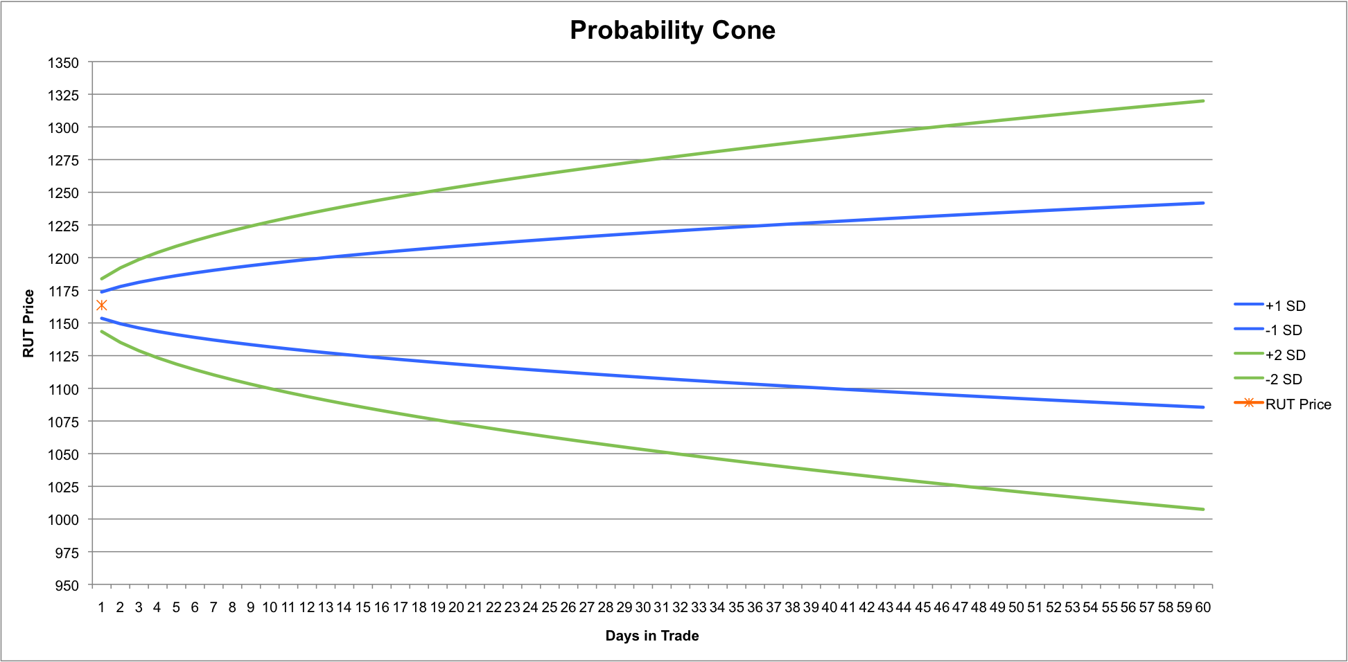
Note: Being short options on both sides of the market increases the chance of running into trouble. I view non-directional options trading as a way to increase diversification rather than as a stand alone strategy.
Trade Specifics:
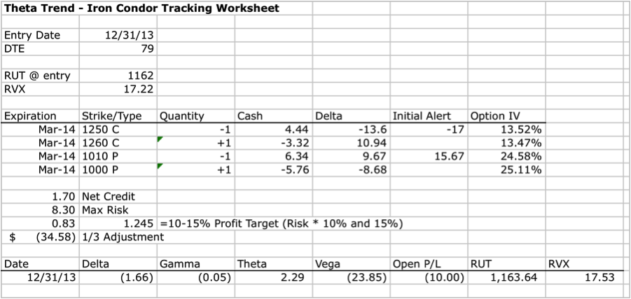
Yesterday morning I sold the 1010/1000/1250/1260 March 2014 $RUT Iron Condor with 79 days to expiration for 1.70. My position spreadsheet for the trade is shown below. My profit target for the trade is somewhere between $83-$125, which represents a 10-15% return on risk. The trade has a higher than 50% probability of success so that range also represents my maximum loss. My initial adjustment points are triggered if there is a 7ish delta increase on either short option or the trade closes down around $35.
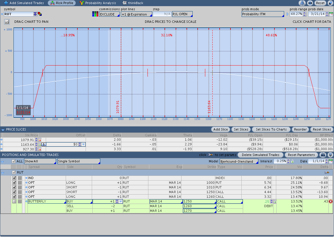
 Risk Graph on 12/31/2013:
The risk graph below shows the current position and as of yesterday the trade is down about $10 (not including commissions). As you can see, I was looking at the impact of using a butterfly to roll up the call side of the Iron Condor.
Questions:
If you have any questions or feedback about the specifics of what I’m doing above, please let me know in the comments below. If you have questions, other people probably do as well so don’t be afraid to ask. Thanks for reading and Happy New Year.
Happy New Year Dan.
I have a question about using the probability cone. I followed the link on this page but it doesn’t go to Dan Sheridan. I’d like to understand how to improve my trading by using the cone so maybe there’s a different link to the blog you mentioned here.
Thanks for the great work you do with your trading system.
Dave
Hey Dave, thanks and Happy New Year to you as well.
You’re correct about the link, it goes to the “Gustavo Trades” blog. Dan Sheridan discusses using a probability cone in some of his videos on the CBOE website, but I’d have a hard time directing you to the specific video or videos where he mentions it. Here’s a direct link to Gustavo’s blog where he goes into a little more detail on the cone:
http://gustavotrades.blogspot.com/2009/08/understanding-volatility-cone.html
I’d note that the cone is mainly just a good tool for tracking positions and visually understanding why an Iron Condor, Butterfly, Calendar, etc is in trouble. If you’ve ever taken heat on an Iron Condor before, you already have a sense for what it “feels” like when the market has moved significantly. The cone really just gives you a way to visually quantify the pain you’re experiencing (lovely, I know).
Another thing worth mentioning is that as long as you choose a short delta less than 16, you’re choosing a strike that falls outside of the 1 standard deviation line and inside the 2 standard deviation line. For example, a 10 delta Iron Condor has a roughly 80% probability of success and a 1SD move corresponds to 68%. What we can learn from tracking trades in the cone is that when markets make a greater than 1SD move, we tend to run into trouble with most market neutral strategies.
Let me know if that raises any new questions and thanks for the comment.
Dan
Dan thanks. That’s helpful and I’ll revisit that website and do a bit more digging.
I like the idea of using the cone to visually track your position. Maybe you could post a follow-up in a day or two to see how your position has changed within the cone relative to your original position. Is that a possibility?
Anyway, thanks for your reply and I’ll continue to follow your progress.
Dave
Sure thing Dave. I’m planning to plot the position on a daily basis in the cone and I’ll include updates as the trade progresses. At a minimum, I’ll include an image of the trade in the cone with the weekly recap.
Thanks,
Dan
That’s awesome. I’ll watch to see how it progresses Dan.
Dave